Project Overview
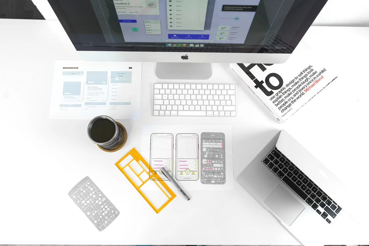
Exploring grid structures and typography manipulation in a series of conceptual posters designed specifically for print. Testing the boundaries between readability and expressive artwork using intense color combinations and experimental text alignment.
The Challenge
Preparing dense layering styles specifically utilizing CMYK color limitations to guarantee the actual prints match the digital luminosity. Focus was heavily rooted in maintaining the delicate balance between chaos and structure.